Quick-Pay
overview
Quick-Pay is a financing product designed to provide fast, flexible funding for produce growers. It allows farmers to receive funding for their orders almost immediately after shipment, rather than waiting for the traditional payment cycles which could take upwards of 30 days. This accelerated access to funds helps growers manage cash flow more effectively, invest in their operations, and meet financial obligations without delay.
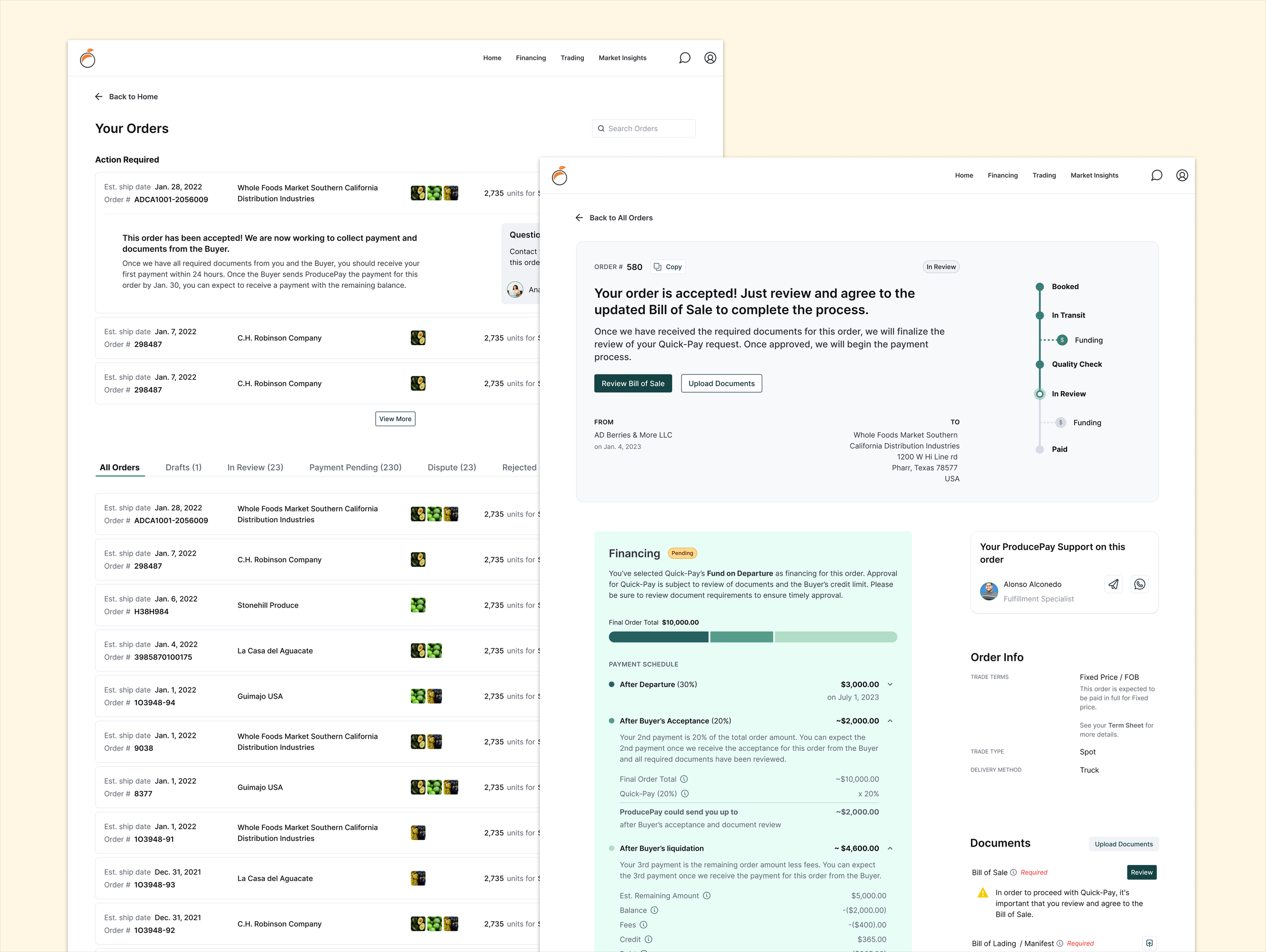
Despite being one of ProducePay's most used services, Quick-Pay had no digital interface for customers to create and manage their orders, understand what’s next and when they receive their funding. My design aims to fill this gap by providing a seamless, transparent, and trustworthy experience for users.
My Role
Lead Designer
Duration
Jul. 2022 - Aug. 2023
Project Managment
Company
ProducePay
Tools
Figma, Photoshop, Usertesting.com
PROBLEM
Customers often reached out to their reps about delayed funds, unaware they had incomplete tasks required for disbursement. This showed me there was:
Lack of Transparency: Quick-Pay users faced a lack of transparency in the funding process, leading to uncertainty and dissatisfaction.
Inconsistent Communication: There was no centralized platform for communication between growers, buyers, and financial departments, leading to information silos.
Lack of Trust: The absence of a clear and user-friendly interface had led to trust issues among the users of Quick-Pay.
So I posed the question …
How might we create a trustworthy experience for growers to manage their orders and provide transparency into their Quick-Pay payments?
Service blueprint
I started by creating a service blueprint of the customer’s journey through Quick-Pay which was a true eye-opener, revealing a series of discrepancies and gaps that went far beyond the user experience.
I discovered issues in our internal processes, broken systems, and points in the user journey where our service was falling short of expectations. My findings were so impactful that they triggered the initiation of another major project aimed at making updates and fixing the identified internal issues.
I set out to simplify the presentation of QuickPay’s complex product offerings, making them clear and approachable for farmers to easily understand and act on.
I wanted to design a centralized experience that clearly communicated the status of each order, giving customers visibility into required actions, next steps, and when to expect their funding.
Optimizing
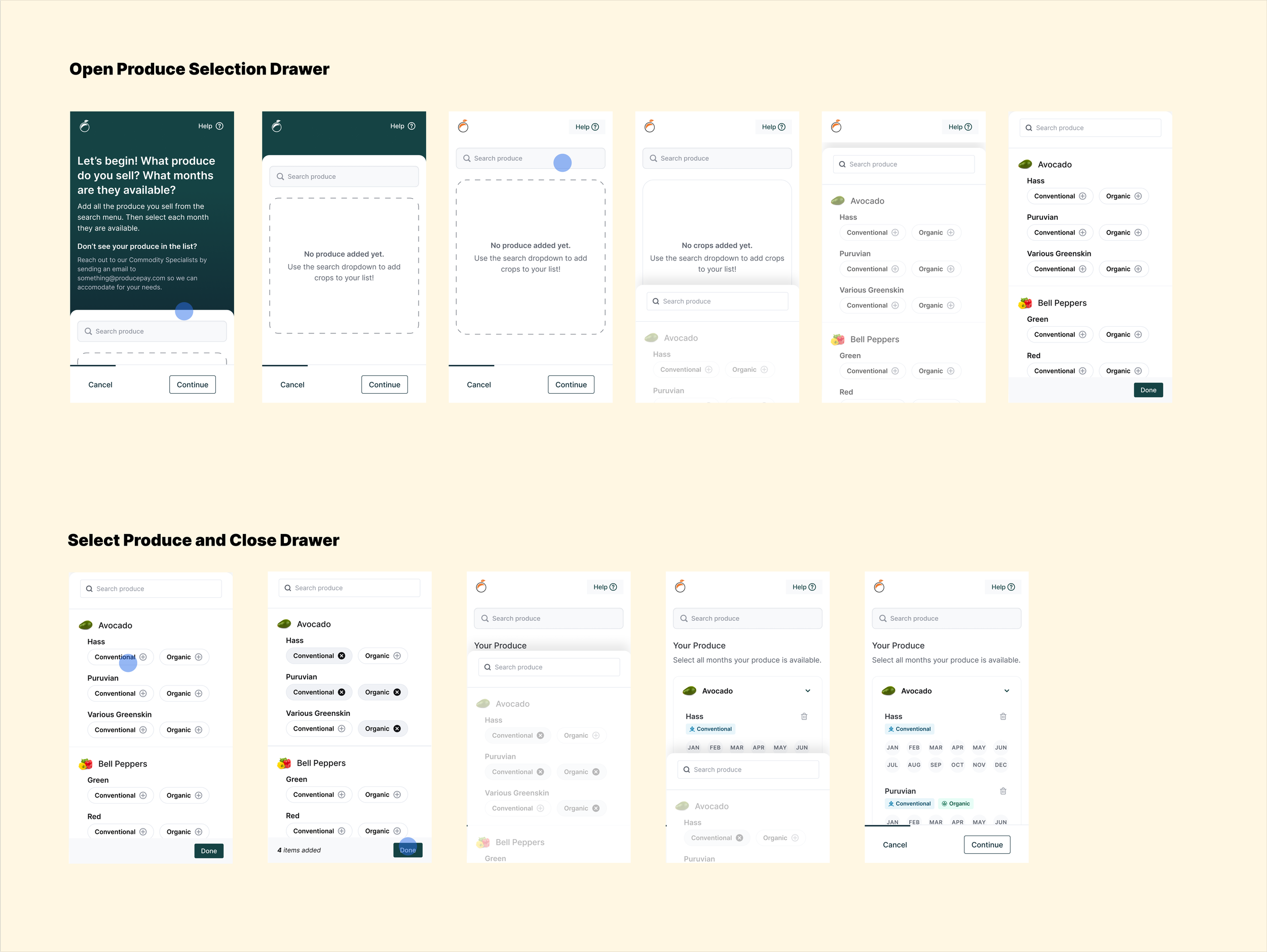
From my user research, I uncovered that users were deterred from creating orders on our platform—primarily because the process was too time-consuming and required manual data entry, which was duplicative work for them.
To replace these manual steps, I proposed the use of Optical Character Recognition (OCR) technology. This functionality allows for the automated extraction of content from uploaded documents, freeing users from the tedious task of manual data entry for each order.
Not only does this solution enhance the Quick-Pay service but it's also scalable and adaptable, set to be utilized in multiple capacities across the company.
Interaction Design
OUTCOME
Through a carefully coordinated process of user research, high-fidelity prototyping, and constant stakeholder engagement, we're transitioning from a problem-ridden manual system to a technologically advanced solution.
Although the project is still in the development phase, the initial feedback from stakeholders and early user tests have been overwhelmingly positive. The engineering team is actively building upon the robust framework I designed, and we're all eager to see this project come to fruition. The project is shaping up to not only meet but exceed, the initial objectives of improving transparency, communication, and trust within the Quick-Pay ecosystem.


